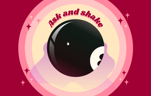
7: Shake animation of 8 ball
The next step now is to create the shake effect of the 8 ball.
This first shake is a little different to any preceding shakes as the first shake shakes the white ball and then transitions to the back face to display the result. Any further shakes stay on the back face of the magic 8 ball and do not require the white 8 ball shake again.
So to specify which shake is needed, the first thing I did was to set a variable to let us know if the first shake has happened yet or not. Initially the variable is set to false, however once the first shake has happened, the variable is set to true and now all further shakes will use the preceding shake animation rather than the first.
var firstShakeCompleted = false;
Creating the shake animation
There are some shake animation resources using CSS keyframes, however because they use transform and this is also how I have centered all of the images on the page, I had to play around with them until I got an animation that worked.
I ended up with the below which uses translate and rotate to slightly adjust the existing centering of translate: -50%, -50% to create the effect.
    @keyframes shake {
        0% { top: 49%; left: 51%; transform: translate(-49%, -51%) rotate(0deg); }
        10% { top: 49%; left: 48%; transform: translate(-49%, -48%) rotate(-1deg); }
        20% { top: 47%; left: 50%; transform: translate(-47%, -50%p) rotate(1deg); }
        30% { top: 53%; left: 52%; transform: translate(-53%, -52%) rotate(0deg); }
        40% { top: 51%; left: 49%; transform: translate(-51%, -49%) rotate(1deg); }
        50% { top: 49%; left: 52%; transform: translate(-49%, -52%) rotate(-1deg); }
        60% { top: 47%; left: 51%; transform: translate(-47%, -51%) rotate(0deg); }
        70% { top: 53%; left: 51%; transform: translate(-53%, -51%) rotate(-1deg); }
        80% { top: 49%; left: 49%; transform: translate(-49%, -49%) rotate(1deg); }
        90% { top: 51%; left: 52%; transform: translate(-51%, -52%) rotate(0deg); }
        100% { top: 51%; left: 48%; transform: translate(-51%, -52%) rotate(-1deg); }
        }
For the properties of the shake animation, I set the iteration count to be infinite so as to not stop before the shake was complete, and then defined the length to be 0.5 seconds which could then be easily changed if it needed to go slightly longer or shorter.
    animation: shake 0.5s;
    animation-iteration-count: infinite;
This ended up resulting in the below as the initial shake animation, which was later tweaked and refined more as the site progressed: